Portfolio Modernization

From Hand-Coded Portfolio to Product-Grade Experience

This portfolio refresh was approached as a product surface with adaptive theme behavior, keyboard-first accessibility, and deep-link storytelling patterns that make intent visible in every interaction. Codex AI was used as a production tool to accelerate implementation and documentation, not as a replacement for design sensibilities, judgment, or craft.

Updated portfolio homepage in light theme
The Challenge

Raise quality without adding friction

The original template communicated the work, but not the craft behind it. The refresh focused on shipping UX systems, not just visuals: resilient theme logic, reliable accessibility states, and linkable narrative context inside the archive.

Execution

How Codex compressed the build cycle

01

Scaffold Fast

Started from the existing case-study architecture so structure, spacing, and component behavior stayed aligned with the broader site system.

02

Ship Behavior

Implemented persistent theme state, keyboard-visible focus logic, and query-driven archive state to move from static pages to product-like interactions.

03

Prove the Work

Captured production-accurate screenshots and close callouts so every UX decision is demonstrated, not just described.

Theme System

Theme behavior users can trust

Zoomed theme toggle in light mode

Light: Explicit Preference

Zoomed theme toggle in dark mode

Dark: Explicit Preference

Zoomed theme toggle in auto mode

Auto: System-Aware

Zoomed theme toggle with visible keyboard focus ring

Focused: Keyboard Visible

Accessibility

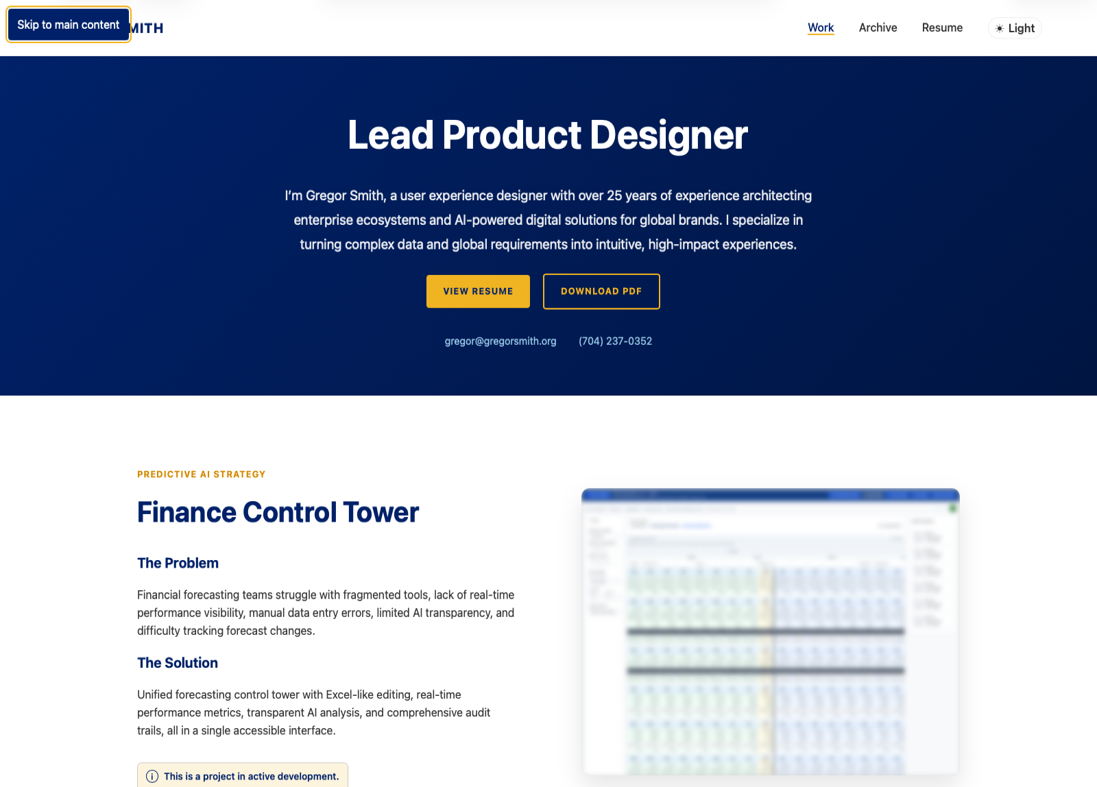
Accessibility as a default, not a retrofit

I implemented keyboard-first interaction coverage across navigation, controls, and modal flows. The result is predictable focus behavior, clear visual feedback, and reduced effort for users navigating without a mouse.

01 / Skip Link + Focus States

Critical paths are reachable immediately with visible focus context.

02 / Modal Focus Management

Dialogs preserve context, trap focus correctly, and return users to the originating control.

Close crop showing skip link in visible keyboard focus state
WCAG Compliance

Implement and validate against WCAG 2.2 AA as features shipped

Accessibility coverage was tied directly to WCAG 2.2 AA criteria during implementation, so compliance was verified in the build process rather than deferred to a final audit.

2.1.1 Keyboard + 2.4.3 Focus Order

Interactive controls are operable end-to-end in a predictable order across navigation, archive, and dialog states.

2.4.7 Focus Visible + 2.4.1 Bypass Blocks

Focus visibility and bypass patterns provide immediate orientation and lower repeated navigation effort.

1.4.3 Contrast + 1.4.10 Reflow

Theme modes maintain readable contrast, and layouts preserve task continuity under zoom and narrow viewports.

Codex Screenshots

Use Codex to generate production-accurate case-study screenshots

Codex automated screenshot capture, crop QA, and file organization so visuals reflected actual shipped states instead of manual recreations.

01

Capture variant states

Automated captures covered light, dark, auto, and keyboard-focused states with consistent framing.

02

Run crop and framing QA

QA passes checked composition, legibility, and object-position behavior before images were published.

03

Publish reusable assets

Approved files were organized with consistent naming so future iterations can reuse the same workflow.

Archive Experience

Deep-linking that explains itself

The archive now supports query-driven context. A link like ?agency=thatsnice auto-sorts by company, highlights matching records, and surfaces a clear reset action, turning a generic listing into a guided story state.

Archive sort controls with clear highlight action visible

Stateful Filter Controls

Highlighted archive cards after deep-link agency filtering

Context-Aware Highlighting

Evolution

Legacy layout to product-grade system

2015 portfolio homepage before the refresh

Before: 2015-2022 Material Design Portfolio

Current portfolio homepage after the refresh

After: 2026 Portfolio Refresh

The Outcome

Stronger product signal, clearer UX stories

Adaptive Interface Layer

Theme state now behaves consistently across light, dark, and auto modes with explicit, user-readable control states.

Accessible by Interaction

Keyboard navigation, focus visibility, and modal semantics now work as a coherent system across high-traffic user flows.

Back to Work